
Hotel Tableware Color Schemes in Colorful Tableware and Monochrome Dinnerware for Design-Driven Dining
Colorful tableware at MyGlassStudio starts with the room, not the plate. Before the tableware arrives, a hotel dining room has already committed to a wall finish, a floor material, a lighting temperature, an upholstery choice. The tableware walks into that room and either belongs or it does not. Hotel tableware color schemes that ignore the interior brief do not fail because the colour is wrong. They fail because the colour was chosen in the wrong order.
For hotels and restaurants, the practical approach is to start with the interior palette and move outward to the tabletop. Warm terracotta reads one way under tungsten candlelight and a completely different way under the cool daylight of a lobby. The colour does not change. The room does.
Designer dinnerware color schemes at MyGlassStudio are developed with that logic in mind. The collection covers expressive statement colours, soft tone-on-tone palettes, one-tone dinnerware for understated luxury, and monochrome dinnerware for spaces that want coherence without pattern. For spaces seeking bold visual energy, colorful dinnerware with metallic accents or jewel-inspired palettes anchors the tabletop to a clearly defined design intent. Hotel tableware color schemes across our range are available in 160 Pantone-designated colours. Browse the colour collections below, or visit our designer dinnerware and bespoke dinnerware pages to develop a custom colour direction.

Black & Gold
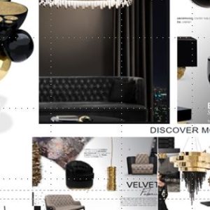
Black and gold dinner plates are a commitment rather than a default, and they reward th...
Learn moreWhite & Gold
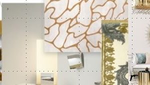
White and gold dinnerware is one of those pairings that looks obvious until you try to ...
Learn moreGray Metallics

Grey doesn’t have to be cold. Gray dinner plates in metallic glass carry the warm...
Learn moreDusk Blue
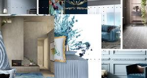
Some blues shout. Dusk blue doesn’t. Coastal dinner plates in this mood read like...
Learn moreLux Brown
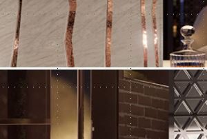
Brown dinner plates from the Lux Brown range are not the brown of a safe neutral. Metal...
Learn moreTerracotta
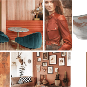
Rust color dinner plates from the Terracotta range do not sit in one register. Metallic...
Learn moreNeo Mint
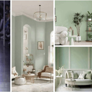
Most green tableware picks a side, going either candy-bright or cool and clinical, and ...
Learn moreNaturals

Some rooms are designed down to the grout, and the last thing they need is loud tablewa...
Learn moreAegean Teal
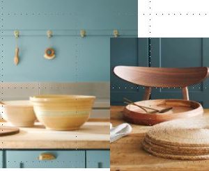
Teal dinner plates from the Aegean Teal range sit in the space between coastal calm and...
Learn moreGraphic Charcoal
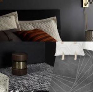
Industrial rooms are unforgiving to tableware that tries too hard. Dark gray dinner pla...
Learn moreNaval
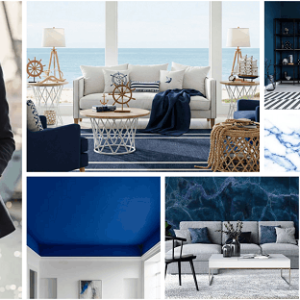
Navy blue dinner plates from the Naval range are the most minimal brief in the blue fam...
Learn moreDark Aqua
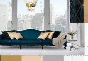
Dark aqua dinner plates from this range sit in a colour that does not resolve into teal...
Learn morePurple Gold
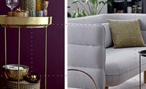
Purple and gold dinner plates from the Purple Gold range are built on a pairing that ha...
Learn moreApricot Crush

Peach dinner plates from the Apricot Crush range sit at the warmer end of the soft pale...
Learn moreWhite & Pink
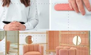
Pastel pink dinnerware reads as dusty rose against brass, cream linen, and pale wood. T...
Learn moreLux Green
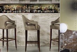
Dark green dinner plates sit naturally against mahogany bars, brass pendants, and cream...
Learn moreCantaloupe
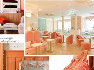
Burnt orange dinner plates from the Cantaloupe range land at the saturated, confident e...
Learn moreBlack & Red
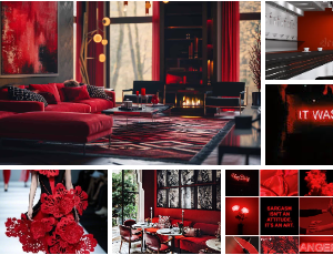
Red and black plates occupy a specific register in hospitality: the brief that wants dr...
Learn moreButtercream
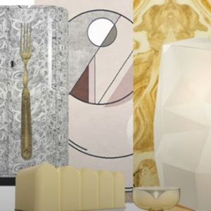
Cream and black dinner plates from the Buttercream range use the oldest high-contrast p...
Learn moreChanel Grays
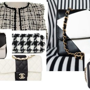
Some greys are cold. This one isn’t. Designer gray dinner plates land between con...
Learn moreMocha Mousse
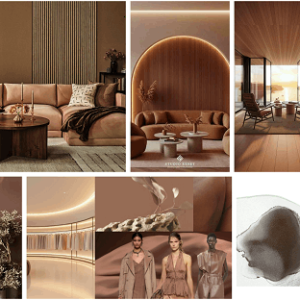
Mocha is a warm colour. A long lunch is built on exactly that. Brown dinnerware in this...
Learn moreOrchid Red
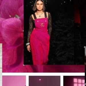
Burgundy dinner plates from the Orchid Red range occupy a specific register: not the co...
Learn moreGreen & White
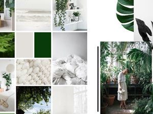
Light green dinner plates from the Green and White range bring grass green and blanc de...
Learn moreBlue Jeans
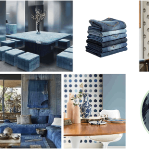
Deep blue dinner plates from the Blue Jeans range sit at the more relaxed end of the bl...
Learn moreSuper Silver

Glass takes a metallic finish in a way porcelain cannot. Silver is where that differenc...
Learn moreBaby Blue
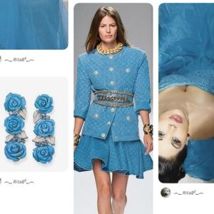
Light blue dinner plates in this range carry the saturated weight of a deep summer sky,...
Learn moreSuper Golden
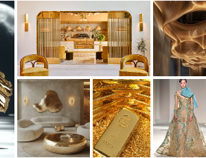
Gold is the easiest colour to get wrong on a luxury table, because a shallow gold reads...
Learn moreBlack & Brown

Dark tables are having a long moment, and most of them get one tone wrong. Black and br...
Learn moreBeach Glass
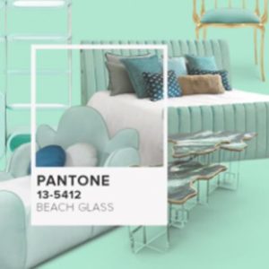
Pastel teal dinner plate from the Beach Glass range sits in the cooler, airier end of t...
Learn moreLeather
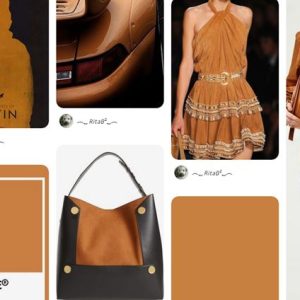
Leather warms a room before anything else does. Put a banquette against dark oak, add a...
Learn more70s Summer
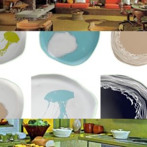
Coastal dinnerware brings the 70s summer palette to a working restaurant table. Turquoi...
Learn moreAfrica & Alpine

Geometric african plates from the Africa and Alpine range draw on two pattern tradition...
Learn moreArabian Desert

A desert resort dining room is usually built before the tableware is chosen. The plaste...
Learn moreModern China
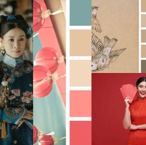
Modern China dinnerware brings the language of Chinese visual tradition into a contempo...
Learn moreMiddle East

Arabesque dinner plates from the Middle East range carry three colours that do not appe...
Learn moreAegean Chic
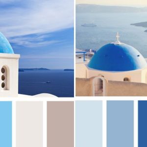
A coastal resort dining room is mostly built before the plates arrive. Whitewashed plas...
Learn moreIndia

Indian design dinnerware belongs in dining rooms built around cultural luxury. Jewel to...
Learn moreItalian Palette
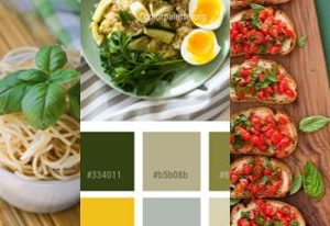
Italian style dinnerware reads warm under restaurant lighting without forcing the refer...
Learn moreCloud Dancer

Most luxury tables fail on white before they fail on anything else. Pick the wrong one ...
Learn moreColorful Dinnerware and Designer Dinnerware Color Schemes for Modern Hospitality
How hotel tableware color schemes are specified in practice
The first question is not what colour looks good. It is what colour survives the room. Glass handles that question differently from ceramic, the pigment is in the material, not sitting on a glaze. Coastal turquoise in glass has depth because light moves through the colour. On glazed porcelain, it reflects off a surface layer. Those are two different visual experiences from the same colour reference.
For hotel F&B programmes, colorful tableware selection follows the interior design brief, not the menu. A warm amber plate in a candlelit bar makes the food glow. The same plate in a cool Nordic interior kills the atmosphere. The brief for a tabletop colour scheme should land on the same desk as the FF&E specification, not after it.
Colorful tableware used well is not about choosing a favourite colour. It is about reading the room accurately and responding to it. A designer dinnerware color schemes brief that starts with the lighting plan and the material palette is a brief that ends with a tabletop that belongs. Browse our turquoise coastal dinnerware, light blue dinner plates, dark green dinner plates, and Arabian Desert beige dinnerware collections for a range of tone directions.
Monochrome Dinnerware and Tone-on-Tone Options
Monochrome dinnerware and tone-on-tone palettes are the most requested starting point for luxury hotel projects. The logic is simple: a single colour developed across plates, bowls, and serving pieces creates visual coherence without requiring the guest to process competing visual information at the table. The food becomes the point of contrast, not the tableware.
One-tone dinnerware in matte black, deep navy, or warm white reads as a deliberate design statement in a fine dining room. It also reads as one less decision to manage when the project involves multiple outlet typologies across a full hotel. For a property with four outlets and three lighting schemes, a tone-on-tone colorful dinnerware approach that holds across all of them is a practical specification, not just an aesthetic one.
For bespoke colour commissions, a specific Pantone reference developed around an FF&E palette, or a custom colour not available in the standard range, visit our bespoke dinnerware page. The full designer dinnerware collection is available with custom colour development for hotel and restaurant programmes.
FAQ
What is colorful tableware?
Tableware where colour is a deliberate design decision, not a default. At MyGlassStudio, colour is fused into the glass body, not applied as a surface coating, so it holds its character through years of professional service.
How do hotel tableware color schemes work with interior design?
The tabletop palette responds to the room’s dominant tones, lighting temperature, and material surfaces. A colour chosen in isolation from the interior brief rarely works as well as one specified alongside the FF&E.
What is monochrome dinnerware?
A collection where all pieces share a single colour or a tight tonal range. It creates visual coherence at the table without pattern or contrast, letting the food provide the visual interest.
What is tone-on-tone dinnerware?
Tableware where pieces vary slightly in shade within a single colour family. The variation creates depth at the table. No second colour is introduced, which keeps the scheme coherent.
Can hotel tableware color schemes be developed around a specific Pantone reference?
Yes. MyGlassStudio produces in 160 Pantone-designated colours as standard. Custom colour development is available for references outside the standard range.
How does glass carry colour differently from ceramic?
Pigment is fused into the glass body at kiln temperature. The colour sits inside the material, not on top of it. Light moves through it rather than bouncing off a glaze, which is why the same colour reference looks deeper and warmer in glass than on a coated surface.
What is designer dinnerware color scheme specification for a hotel?
A process of matching tabletop colour direction to the interior architecture and lighting of each outlet. The specification should be done alongside the FF&E brief, not after it.
Is colorful dinnerware practical for professional kitchen use?
Colours are dishwasher safe at up to 90°C for 1,000 or more cycles. They are fused permanently into the glass and cannot fade, flake, or change under normal professional service conditions.
Can a hotel specify different colour directions for different outlets?
Yes. Each outlet is treated as a separate brief. Collections can share a material language while carrying different colour directions across dining room, bar, lobby lounge, and in-room formats.
What is the minimum order for a custom color direction in colorful tableware?
Minimum quantities are confirmed at the brief stage. No blanket minimum applies. It varies by format and production complexity. Start with the brief form on the bespoke dinnerware page.